The web is getting bigger. It is also getting slower. The funny thing is, every single day I’m visiting new sites to try out a new product or read a blog, and I find the same performance issues over and over again. All I have to do is check out DevTools to see that most images are way too large.
What baffles me is how easy it is to fix this. The fastest way to increase the performance of any site is to losslessly compress images that are being displayed. In fact, it’s so easy, anyone on your team, regardless of coding experience, can make a dent in improving performance.
Compressing images should be automatic
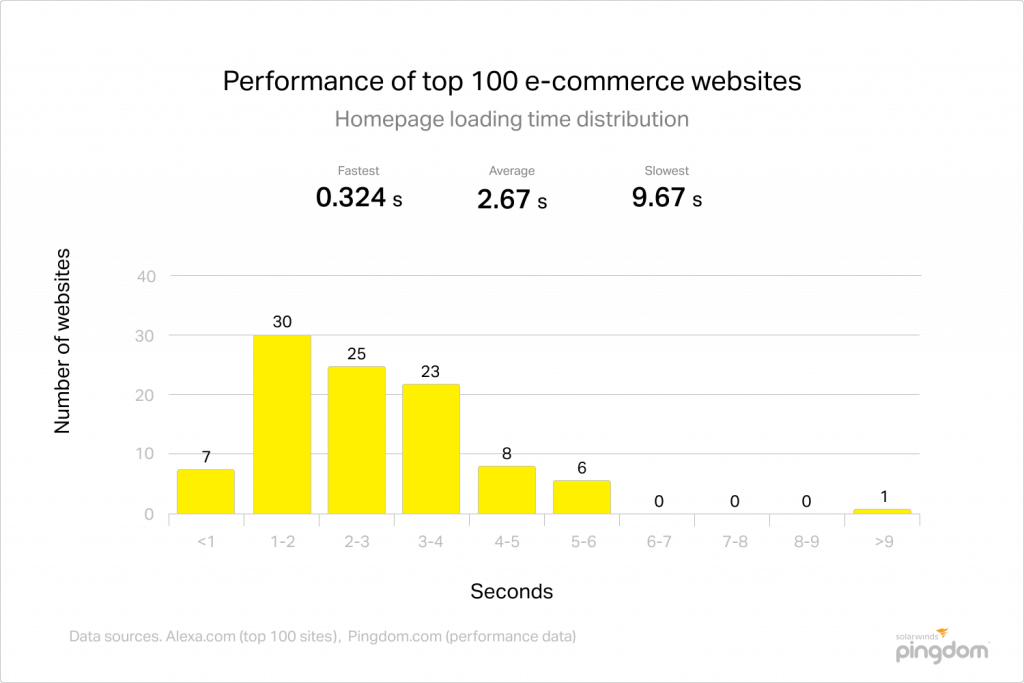
The average page size is 1.88 MB, with the majority of that weight coming from images. So if the bulk of a site is images, we should be focusing on image optimization before we focus on things like database indexing, caching, or other more advanced forms of performance optimization.
The 4 levels of image optimization
There are four major levels of effort required to reduce the size of image data. Each level builds off of the previous one, so be sure to complete level 1 before moving onto level 2.
The first level requires the least amount of work (which can be accomplished in minutes). The fourth level requires all of the previous steps as well as its own set of tasks. This can take hours, if not days, depending on how image-heavy your content is.
Each level provides diminishing returns. Simply completing one level will do more for your performance than the next level. Which is why it’s important not to skip any steps.
Level 1: Lossless compression
The first thing you should do is grab a copy of ImageOptim. This tiny application is your new best friend. ImageOptim will scan every image within a folder you select, and automatically compress the image, removing all of the useless data.
In the context of this blog, useless data refers to anything that doesn’t contribute to the visual quality of the image being displayed. In fact, the term lossless refers to the ability to reconstruct the original data from the compressed data without losing any information needed to render that data.
For example, did you know that a photo can store the name of the author of that picture? That comment might be useful in protecting the copyright of the photographer, but it has zero effect on what your application will look like to the world. That metadata is lossless, and if you were to run lossless compression on that JPG photograph, it would strip out this and dozens of other metadata fields.
What you may not realize is that this kind of metadata makes up a very large part of the image’s total size. This is exactly why lossless compression is so important. Removing lossless data does not affect the visual quality of your images, but it can drastically reduce their size. And the smaller the image, the less your browser has to download to retrieve from the server where the image is hosted.
That is why running ImageOptim should be a no-brainer. It only takes a few minutes to run and provides potentially big savings in size without a reduction in quality.
Level 2: Targeted lossy compression
The next level requires a little more work, but even more savings. At this point, you’ll have to make specific fixes for each image type. We’ll break this down for the 3 major image types (and if you aren’t using one of these three, make sure you check out the next step):

JPG
If you’ve already run a JPG through ImageOptim, you’ll have to download another piece of software. There are additional options for JPGs in ImageOptim preferences, such as removing metadata, but I’ve found that removing color profile metadata actually colorizes images to include a bit more greens and yellows.
So which should you choose? JpegMini handles both lossless and lossy compression and allows you to resize your images.
With regards to image sizing, use the correct image size. If you have an image that is 512x512 pixels, but the image is only being used in a 64x64 canvas, scale down that image. Worried about Retina displays? Check out level 4 for more details.
Another tip: Reduce image quality for JPGs down to 80% by default. JPG is a lossy format in general, but a very in-depth analysis of JPG compression quality shows that there is effectively zero difference in visual quality, but significant savings in file size.
PNG
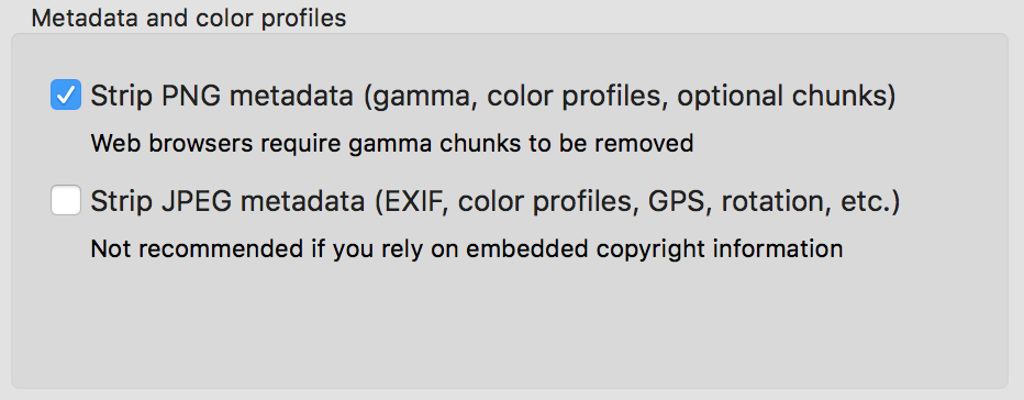
Before you need to download anything, you should strip PNG metadata in ImageOptim. This is safe to do for PNGs and I’ve yet to see a PNG image that looks off by removing metadata.
OptiPNG is the next level PNG optimizer after ImageOptim. It has far more algorithms for compressing PNGs and tries far more options to get a truly optimal PNG file size.

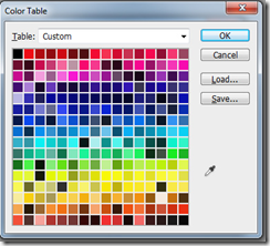
In addition to compression, PNGs are far more sensitive to using the correct color profiles. If you have a black-and-white PNG, using a colorless profile will save a ton of space. From there, choose the correct color palette size to restrict the number of colors to an acceptable range. Applications like Photoshop will show you a preview when saving your image, so feel free to play with color palette sizes until you see something that reduces the number of colors without reducing the image quality.
GIF
Again, ImageOptim will do a solid job optimizing all image types, including GIFs. However, for a more customized compression technique, take a look at FileOptimizer with the additional plugins for GifSicle and GifSicle Lossy. These combined seem to do a good job of maintaining image quality while drastically reducing the size of the file.
Level 3: Convert to the correct image type


At this point, you’ve already exhausted even the most advanced compression optimization techniques. And while these programs do all of the work for you in a matter of seconds, the truth is you may need to scrap your images altogether if they are in the wrong image format.
How do you know if they’re in the right format? Follow this simple questionnaire and then save your image into the new file format (and then repeat levels 1 and 2 to compress your new images!).
Does it look like a photograph? Use a JPG
JPGs were meant to be used with photographs. If you have avatars of your team, photographs of your office, or other real-life images, make sure they are in the JPG format.
Does it look like a computer-generated graphic or drawing? Use a PNG
Everything else can be a PNG. Other formats may provide better quality, but if you’re serving a web or image application, a PNG will do and is universally read by every kind of application. The one exception to this would be icons…
Does it look like an icon? Use an SVG
Icons are also computer-generated, but the difference is that icons are generally used alongside typography. If you think the image will be used in a menu, on a button, or is meant to symbolize something, it’s probably an icon, and icons will benefit from being SVGs because they can be scaled along with your type and lose 0 fidelity. They will look just as crisp as your fonts and will be much smaller as SVGs as well.
Are you supporting the latest browsers and don’t care about Firefox? Use WebP, JPEG 2000, and JPEG XR
Finally, there is a push for next-generation image formats. JPG and PNG have been around for more than two decades, and it’s about time we have some new formats that innovate to maintain image quality without bloating our applications. Even better, they don’t require you decide between image type. For example, WebP works great for both photographs and computer-generated images.
The downside is that support is fragmented across devices and browsers. WebP was made by Google, so it’s naturally designed only for Chrome and Chrome mobile. JPG also has evolved formats, but JPEG2000 is only supported by Apple (Safari and Safari Mobile), while JPEG XR is only supported by Microsoft (IE and IE Edge).
What about Firefox? There is no next-gen format for this browser, but they do have a 2-year-old bug ticket to implement WebP and it is assigned, but who knows when this will land.
Level 4: Source sets & fallbacks
If you’ve chosen the correct image and you’ve compressed the heck out of it, you’ll want to make sure it’s being served on the right device in the right aspect ratio. I alluded to this back in Level 2, but if you have concerns about Retina displays like MacBook Pros, or even x3 quality for the newest iPhones, you’ll want to ake multiple copies of your image in all of these formats.
Going back to the previous example, if you serve avatars in a 64x64 JPG format, you’ll also want to make copies of dimension 128x128 for Retina and 192x192 for Retina x3. The best way to do this is to start with a larger image and scale down, rather than scale up. You know those crime dramas where they ask the hacker to “Zoom! Enhance!”? We all know that doesn’t work in real life, and that same thing holds true for your images - you can’t add clarity where there was none in the first place.
Instead, start with the original source image (say, 512x512) and scale down to 192, save a copy, then 128, save another copy, then 64, and save that last copy. This will result in a less blurry, albeit still lossy (because you are removing information in the form of pixel fidelity) set of images.
With all of these duplicate, scaled images, how do we tie this all together? The image attribute known as srcset comes to the rescue:
<img src="avatar.jpg" srcset="avatar-sm.jpg 1x, avatar-md.jpg 2x, avatar-lg.jpg 3x" alt="Your responsive photo avatar">
Srcset is pretty amazing. It will always default to the original 1x magnifier like a normal image tag would. However, if it does find the other images, it will apply them to the given aspect ratios for your device. In other words, if you are viewing the photo on a 2015 MacBook Pro, the browser will select avatar-md.jpg, but if you are on an iPhone X, it will select avatar-lg.jpg. And if you’re in a military bunker using IE8, it will fall back to avatar-sm.jpg.
Sizes is another property for responsive images but it relies on the width of the device rather than the pixel density. The format is the same:
<img src="bg-slim.png" srcset="bg-slim.png 320w, bg-wide.png 900w" sizes="(max-width: 600px) 320px, 50vw" alt="Your responsive background">
You specify an image, space, the size the image should be displayed, with a w descriptor for the srcset, and then, using the sizes attribute, specify the media queries at which point the various sources should be used.
The only downside? Srcset is not supported in IE. It is supported in IE Edge, and the sizes attribute is supported everywhere. In my honest opinion, this isn’t something to worry about because all of the Retina devices using IE are already new enough to support IE Edge. Anything that still requires IE11 and down likely doesn’t have a Retina display anyway (unless it is connected to an hi-density external monitor) so you likely won’t run into this problem being a real blocker for you.
Something is better than nothing
This is not an exhaustive list of image optimization techniques nor is it meant to be a prescriptive formula. Even if you only run ImageOptim on all of your images in your application, you could be saving upwards of 60-80% of what your users have to download.
Images, audio, and video, not your source code, will comprise the largest space for your application by far. Effectively choosing, compressing, and displaying your images will have a marked impact on both application size and performance for your end user experience. The best part is it only takes a few downloads and a few more seconds to run your images through a very easy set of tools that will provide an instant improvement without sacrificing quality.
Get the FREE UI crash course
Sign up for our newsletter and receive a free UI crash course to help you build beautiful applications without needing a design background. Just enter your email below and you'll get a download link instantly.

